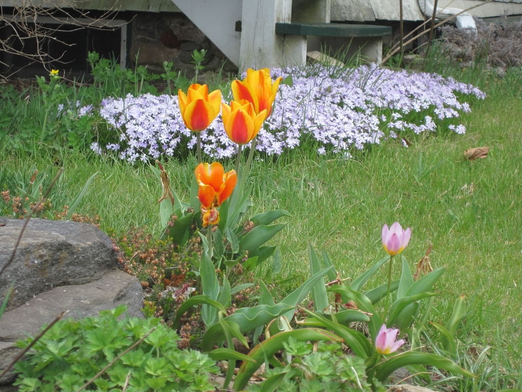
I couldn’t actually get a good photograph of this, the framing was all wrong, as is the placement; but, a good example of how once in awhile a really bold color combination can work. This is accidental, but the orange and the pink don’t seem to clash. Perhaps because none of them are really ‘pastel’ or ‘soft’; the phlox isn’t due to its sheer size, the tulips by nature. I’m not really a fan of ‘hot’ borders and that sort of thing, but bold colors as accents do catch the eye.

Signs of Spring!